As I write a pandemic is sweeping the globe at an alarming rate and no one, except me, seems to be concerned. Preliminary research suggest that those most susceptible to infection are males between the age of 16-35. Symptoms are varied, but most sufferers will exhibit reduced mental capacity, have an unexplained urge to dress in nylon and will uncontrollably shout ‘REF!’ in crowded spaces.
This pandemic goes by many names, in American they call it Socceritus, in Germany it’s Weltcupfieber, but you probably know it as ‘Word Cup Fever’ and it is spreading with the lightning-pace of a diminutive Argentinian winger. I would like to say that I am immune, but like Marie Curie who discovered radioactivity and subsequently died form radiation poisoning, I fear my body is losing the fight against this particular disease and soon the Mark Fountain people once knew and tolerated will be no more.
On the plus side, the Mexican wave of hysteria that is World Cup Fever affects different people in different ways. Some suffers can even display useful symptoms. Some will chase a ball around a park for hours on end, while others will find themselves umbilical tied to their sofas. Speaking from personal experience, my fever manifested itself in an urge to scroll through pages and pages of vintage football shirts on oldfootballshirts.com to find the best and worst national football shirts throughout history. This was something I thought should be shared with you lot.
Designing a national team shirt must be a great opportunity and a real ball ache. A few weeks ago I wrote about the perils and pitfalls of designing an Olympic mascot, but a football shirt has a much more popular edge to it. A great football shirt will become fetish material and be worn again and again by blokes in pubs through the ages. It’s a pretty tough brief for any designer to encapsulate your nation’s identity and culture in a single piece of nylon, but let’s see how some of them chose to tackle it.

England - 3rd Kit, 1990
When it comes to the World Cup you have to be patriotic, so the first shirt on the list is this Marmite In-Ger-Land 3rd kit worn by ‘our boys’ at Italia 90. It was a tournament remembered for everything but the football; Pavarotti’s Nessun Dorma, Gazza’s tears and Frank Rijkaard spitting on Rudi Völler all kept fans and pundits distracted from the crushingly-dull defensive football that dominated the tournament. But all that said, it has been a very long time since England played so well or looked so jazzy.

Holland - Home, 1987
Kicking off the late 80s and 90s tradition of making your football shirt look like a magic eye picture, this Adidas kit for Holland was a classic of the genre and if you squint your eyes and bob your head around you should be able to make out a wistful mermaid looking out to sea.

Australia - Home, 1991
Magic eye inspired design may be one thing, but the inspiration for this Australia home kit from 1991 seemed to be a remedial art therapy class. It really looks like the designer was working through some potent existential angst here. A delicate nuance that I’m guessing was probably lost on all the Fosters swilling ‘Socceroos’ who wore it.

Italy - 1994
If the World Cup were decided on who had the best shirt, USA ’94 would undoubtedly have been awarded to the Italians. Even Roberto Baggio’s horrendous pony tail couldn’t distract form the fact that Italy’s kit was a thing of Renaissance-like beauty. In reality, the Italians lost out to Brazil in a penalty shootout after an uneventful final and the shirt, like all great art, was destined to be only properly appreciated after it’s death.


USA - Home, 1994
All things considered you would think the US would have been more brash when designing the home kit for their host World Cup in ’94. You would normally expect holograms, maybe red, white and blue LEDs stitched into the collar and definatley an embroidered bald eagle or two, but in reality this shirt was uncharacteristically understated. This must go to prove, once and for all, that Americans really don’t give a shit about football - oh sorry, I mean soccer.

Israel - Away, 1995
This Israel Away shirt form ’95 is pretty smart, especially compared to the modern day Israel away kit, which, I gather, looks something like this…


Nigeria - Home, 1994
There was a troubling documentary on some high-brow channel like More4 or BBC4 a while ago about African football trafficking, where young players from Africa are taken from their homes, harvested for their talent and generally exploited. Pretty horrible, eh? That has nothing to do with this ace shirt, I just wanted to raise awareness. Feed The World etc. etc.

Denmark - Goalkeeper, 1992-3
This shirt only made the cut because it reminded me of the Rainbow Road track on Mario Kart 64, which, by the way, I rule at. We had a little tournament in the Platform office a few weeks ago and by the end it was quiet frankly embarrassing. It was like Schumacher’s dominance of F1 between 2000 and 2004 - fun only for the guy who’s winning.

Scotland - Away, 1989-90
The beauty about being a country who never qualify for the World Cup Finals is that you can really have fun with your shirt design safe in the knowledge that no one will kick up a fuss. This 1990 Scotland shirt actually employed patterns developed in secret by the US military to cause brain aneurysms after prolonged exposure. The Scottish FA thought they might actually win a game if their opponents were distracted by blood coming out of their ears.

Thailand - Home, 1997
It’s an unfortunate reality that some nations are so insignificant in world football that they feel it necessary to remind the rest of the world just who they are. In this case Thailand went for a massive map. It’s sad, in a way.

Russia - Home, 1990
Man, if they produced shirts this good I kind of wish the Soviet Union hadn’t collapsed. And Glenn Beck worries about Obama’s socialist Agenda, at least Americans would be better dressed. Maybe Glenn just thinks he looks fat in red?

Norway - 1996-97
Although I have focused on the positives don’t be fooled into thinking the 90s were the golden age of football shirt design. The clip-art awfulness of this Norway shirt from 1996 single-handedly proves that the good shirts represent just the tip of a very ugly iceberg.

Northern Ireland - Away, 1990-91
It’s a little know fact that this shirt was actually designed by the ghost of M. C. Escher, who worked via a specially trained graphic deign medium.


Germany - 1994
Sometimes you have to give the devil his due. Naturally German shirts were always impeccably designed, with their bold lines and geometric shapes they called to the design conscious amongst us, even though every English strand of our DNA told us it was wrong. However, if you want to laugh at the German’s misfortune (if only there was a German word for that?) then you’ll be pleased to know that they were knocked out in the last 16 by Bulgaria while wearing this shit - just try and forget that ’94 was also the year England failed to qualify.

Mexico - All the kits
It’s good to finish on a high and the frisson of this World Cup kit retrospective had to be Mexico. While Mexico 1970 is widely regarded as the most entertaining World Cup of all time, it was the Mexican national team who have produced some of the oddest, most interesting and flamboyant kits of all time. Variations of the above Aztec design ran from 1997 until 2000. Some of them were more subtle, some more garish and others were designed with a colour pallet of inspired by vomit and mold.
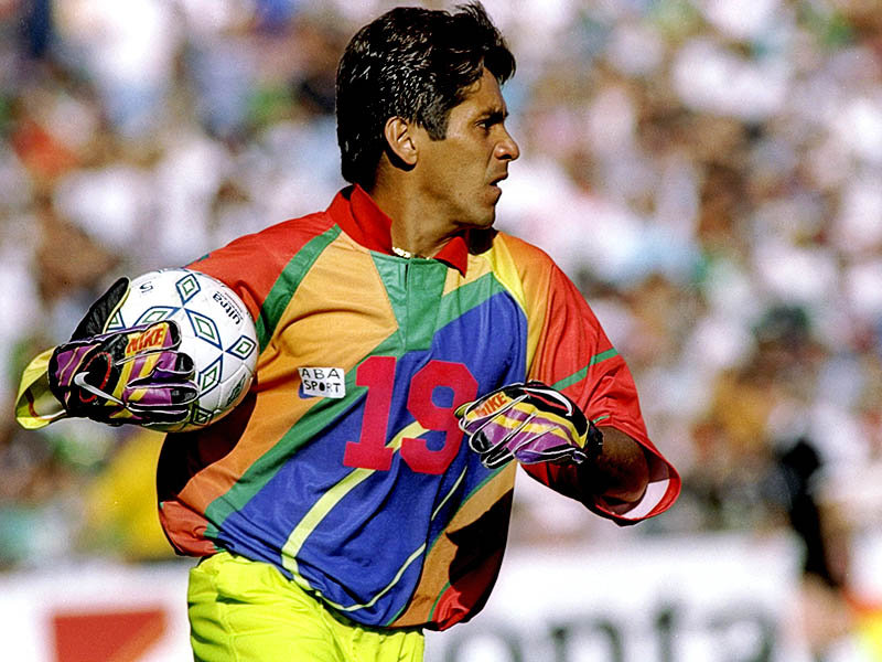
But while the outfield players ran around looking like extras from an Indiana Jones movie set in the year 2050, the Mexico goalkeepers were on a whole other level of ridiculousness. This was summed up on one man, Mexico’s eccentric midget goalkeeping/striker Jorge Campos - here he is scoring and conceding against Brazil in The Confederations Cup in 1999. The cruel amongst you might suggest that at 5 foot 8 inches Jorges was too small to be a world class keeper, but he made up for this deficiency by leaping salmon-like around his goal and scampering out of his penalty area at any opportunity. But the best thing by far about this cheeky little guy was that he designed all his own kits.
Here he is in one of them:

You can facepalm all you want Jorges, but it’s your own fault that you look like a cyber goth on an 18-30 beach holiday. Did you only have highlighters in your pencil case when you were designing this shirt? You silly sausage.
I was going to post a load of pictures of Jorges and his kits below, then I found this lovingly made video on YouTube soundtracked by Savage Garden. My work here is done…
That’s all the football chat for now. I’m off to trawl eBay for 90s Mexico shirts. Bye!